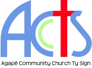
It’s been about 20 years since Agapé’s “ACCTS” logo was first introduced to the masses!
A lot has changed since then – we’ve moved buildings, seen people ‘move on’, or ‘move through’ and others ‘move in’; but there are also things that have remained the same, such as:
- Jesus at the centre
- Church in the community
- Agapé (sacrificial) love amongst each other and those we meet
- Sticking to the mission: Luke 4:18-19
So when it came to updating the logo, a couple of things were there for the keeping:
The Cross – in the new logo this is much more prominent
The ‘C’ Church – still sitting neatly within the ‘C’ Community, affecting the places we go and the people we see with God’s love and compassion. This has greater meaning as we build up our partnerships, working with churches, agencies and residents to see changes in the hearts and lives of the community.
ACCTS – we are part of the new New Testament Church with a heart to move as God moves us and take him wherever we go.
So what’s changed? Actually, not a lot!
Straight away you’ll notice that the ‘A’ is smoother, the curve perhaps being a little bit more modern, more inviting than the old, sharper shape, and leading nicely into the rest of the logo. The font used to create the logo makes it ‘sit up taller’ and is easy to read.
As already mentioned, the ‘T’ as the cross is more prominent, and more of a focal point, there’s no mistaking what we believe, even if someone’s not sure what the logo means!
There are fewer colours in the logo. Did you notice?! Fewer colours can make a logo look cleaner and clearer; the continuity of the colour is pleasing on the eye and, again, makes the red cross stand out.
So what do you think? Do you like Agapé’s new logo? Feel free to leave a comment!

September 28th, 2015 at 12:58 pm
Wow! What deep meaning there is to be sure. Could be at least a sermon’s worth.
As you know I like the logo and thanks to your non-techie notes I now know why.
Do you think the A looks a bit like a church door with the other side open inviting you in?
September 30th, 2015 at 6:56 am
What I like about logos (not just because I’m geeky) is that they often leave enough room for people to interpret something from it for themselves – so, a door? Yes, I can see that!